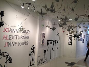
 Walking into the JoAlJi exhibit you feel as if you just entered into some sort of fantasy land, a more whimsical place. With origami and flowers hanging from the ceiling and artwork painted on each wall along with the hanging work, the exhibit addresses your senses and beckons you forward throughout the exhibit. The 3 artists work all flow very well together, making it easy to look at one and then another who all have different styles and mediums of which they make their art but they all adhere to a similar feel making the exhibit spectacular. Joanna Gray, a senior, is a very technical artists with immense skill at painting and drawing people. Much of her work is oil on canvas along with some colored pencil to bring out the shadows and make the image more detailed. Her art has a life like quality and it captivates the viewer, drawing them in close for a better look at the surface of her painting. I think her best work in the echibit is "Natalia" because of the technique and the emotion and the quality of the work. The oil paint on canvas captures the essence of this girl who is very close to Joanna and it astonishes me how well she has mastered the techniques and painting people. Alex Turner, also a senior, uses photography as the main source of his artwork. Many of his images have subtle humor in them, with the image not coming out entirely perfect. Some of his work is a little odd but stops to make you think about what was happening in the photo and how he got to that point and that idea. He also has a series of self portraits which is what I was primarily interested in because he doesn't depict himself in the normal self-portrait way, but one more expressive. The way he arranges space in his self portraits is so interesting and draws in the viewer's attention. The last senior in this show is Jinny Kang. Jinny is very meticulous with her work and just as skilled at drawing people as Joanna. Jinny pays tight attention to detail and a lot of her work is centered around the fun anime cartoons that she draws (much of that was installed on the walls) and her drawings all have a dream like quality. Some work is simple pen on paper but is so ridiculously tight that it looks like it could have been printed. She also completed many still lifes that look like they could have been taken right out of real life due to their attention to detail. Jinny's best work in my opinion is "The Dream that Killed Me" because of a combination of her bright use of vibrant colors along with her tight technical drawing. All three artists stick to a toned down color scheme, without the use of super vibrant colors which is ones of the elements I think helps the flow of the show seems so much better. When asked about the exhibit senior Joanna Gray says, "I'm awesome," which is exactly what the show was.
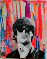
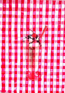 This work took me back to the kind of art I ended last year making with my version of Marilyn Monroe. I used the same gloss paint transfer technique where I print an image and then place it on top of a layer of gloss paint and let dry for a day before using a sponge and rubbing off the paper, leaving the ink in the gloss. This time instead of on a canvas I worked on glass thinking that the final product has potential to be really interesting. First I painted one side of the glass with a plaid picnic blanket like pattern of red and white. Once that side dried I added the gloss image onto the other side so that you would be able to see the background as well as the image. I do not like how translucent the final product came out because I think having a more dominate image would have made the work better. I also want to create a unifying element which is why I reused the transfer idea.
I spent all the class time I had allowed on this project, as well as time out of class. In class, I painted the back side of the glass and found the image I wanted to use for the focal point of the work. Once the gloss paint was down and the image placed in it had to dry for 24 hours. At home i used a sponge and water to peel the paper away leaving the ink from the image in the gloss. This particular work was not very hard to create because the aspects are simple enough to complete. I think the hardest part would be figuring out how to hang this since it is on glass. Overall I think this work is a B, just because I'm not entirely happy with the way that it turned out. I want to play around with these different techniques and see what I can think of. During the critique people suggested that I continue working on glass or possibly plexi glass and continue experimenting with light and how light can play a factor in the work. One person suggested building light boxes to put behind the work as well, which is something I might be able to do. I think I want to work on wood or canvas again and do gloss transfers on that because I can get a cleaner transfer and combine it with other techniques that I like to do. I also want to return to some of the stuff I did this summer because I really like painting like that but I need to focus on one type of subject or topic or one technique that I can use to unify all my different works and maybe add to my college applications.
 This summer I spent the majority of my time simply being a teenager. I hung out with friends and family, went on fun trips, and enjoyed the summer to my best ability. Art is a major hobby of mine so I spent my summer creating many different pieces of work that made me happy. These works really don't have a huge underlying meaning to them because I simply wanted to create work that I like to make. Despite the lack of deep meaning, I did focus on one particular technique all summer which was paint on canvas. Previously I had worked a lot on wood but I wanted to explore a different surface to create work on.
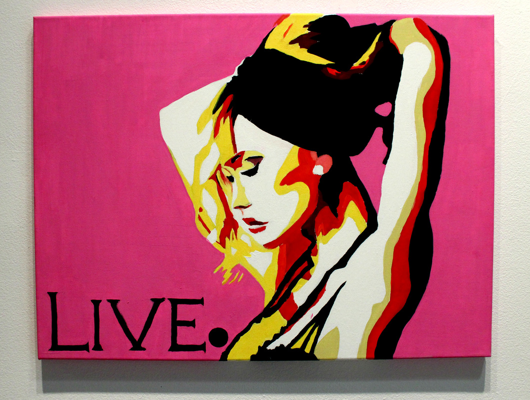
This summer I can honestly say that I spent countless hours working on art. I love making art because it is one of my favorite pass times. Out of the three that I brought into school I invested the most amount of time on the pink "Live" image because I really loved the colors and contrast and to me it was the most fun work to make. I did however invest a lot of time into my other works and a few others that were not brought into school. It didn't seem like it was a burden to have to make the art because I loved making it so much that I would spend entire days starting different projects and doing different crafts for the love of it. Compared to the past I could definitely say that I was a lot more invested in these works because it was completely on my own terms and the works remind me of things that make me truly happy. I think that the biggest challenge that I faced this summer was being really patient when working on the paintings that required me to be more meticulous and exact with the paints. Other than that I didn't really encounter any major challenges because if I ended up creating something that I did not like that much I would paint over it and start again or create something else. That is how some of the canvases that I was working on ended up being so many different layers. I learned how much I really like working on canvas during the summer and I also sort of rediscovered how much I really love making art to make it. I really liked the art that I made this summer so I think that overall I would probably give myself a B+ or A- because I think they came out well and I spent a lot of time working on each piece this summer. I think that much of this work is better than the work that I created last year, but I also feel as though I could make it better by trying to possibly incorporating a deeper meaning to the work, or simply making it ore personal to myself. Not a lot of my work has a deep meaning but they all are similar in the aspect that they have to do 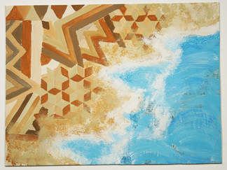 I make the work I do in order to satisfy my love for the natural beauty of the world. To me, nature and the beauty of the world is one of the most influential aspects in my life. I hope that by making art I can show to others how important the world around us is.
In my work I aspire to use materials that resemble how different things in nature look. I incorporate various media that will help to develop the work and also remind people of various things that surround them like textures, colors, patterns, and movement. Challenging known images of beauty of nature, I strive to create a work of art that causes someone to smile while remembering something that they once saw by exploring the different mediums and techniques used to create art. 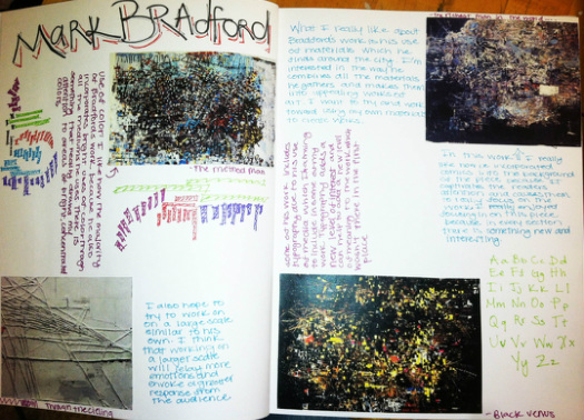
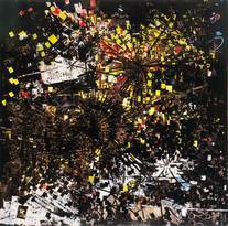 For my second artist study I decided that I wanted to research Mark Bradford, a current artist who creates many abstract pieces. The reason I began to study Bradford was because of his use of materials. A friend suggested him to me and as soon as i looked at some images I began to really like the work that I was seeing. Bradford creates somewhat industrial style looking work using many shapes and materials that he finds around him every day. In his work Method Man (left), he used billboard paper mixed with other mediums to create the work. I really like his use of contrast and the idea of using things that can be found around you to incorporate them into the work. 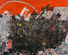 In Scorched Earth, Bradford continues to use billboard paper and other media to create a piece that was influenced by race riots that occurred in the United States during the early 1920's. What I like about Bradford's work is the use of materials and colors that he utilizes in the work to make them so interesting to look at. I also like the depth in his work achieved for the many layers and textures that he uses. In person with his work I feel as if I could stare at it for hours. What I took away from studying Mark Bradford was his wide use of materials. In my newest piece I tried to combine my main idea of the work with materials that I found outside in my yard to mock the different materials that Bradford finds around him and puts in his work.
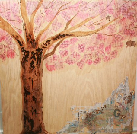 For my second attempt based off of my previous ideas for this project I worked more diligently on the work. I am a lot more proud of this work because I really like the way that it turned out and the process that I went through to achieve this outcome. I went out and bought a large piece of wood that I thought would make a better surface for the work.
I began with using watercolor on the wood and painting a tree, similar to the one from my previous work. After a discussion with the teacher and some more brainstorming I decided that I wanted to experiment with glue. Directly on top of the tree I poured Elmer's glue and then dripped brown acrylic paint in the wet glue. After a 24 hour period the glue had finished drying and the outcome surprised me. I then wanted to work with even more glue so in the bottom corner I used newspaper that I had distressed and covered that in a layer of glue. After that dried I applied another layer of glue where I stuck letters to include typography which I wanted to somehow incorporate in the work. Once again I applied another layer of glue and in this layer I dripped watered down paint of various colors to give the clear glue a tint. I also put in bits of leaves and wood chips I found outside to give the work a natural feel. The last part that I worked on was the "leaves" of the tree. I used citrasolv to transfer interesting patterns that I had printed online to make the design for the leaves. Overall, I am pleased with the final outcome of the work and I want to continue with the techniques that I used in this project in my future works, as well as experiment with more various techniques. Many people liked the different aspects of my work however some thought that it was questionable to combine the two different parts of the bottom corner with the glue and the techniques that I used to design the tree. I think that in my next works I will work on improving both better and somehow trying to incorporate them to have a better visual appeal. 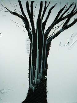 During this two weeks one work period, I struggled with thinking about the possibilities for what I could do as the main subject of my work. Through the process of brainstorming, I came up with an idea for what I wanted to do, however the plan didn't carry out as I thought it would. Overall, I am disappointed with the final product of this work because I do not think that it is a good reflection of what I am fully capable of. I like the subject matter, but the way I achieved the art I am not satisfied with.
I love the idea of a tree being the focal point of the work however, I could have used better materials to make the work better, which I will strive to do during my next work. I really wanted to work with wax on this project and even thought that I could create the whole tree out of wax but i wasn't sure of how to actually create that. I wanted to create a heavy contrast between the tree and the background, but in the end the work just appeared unfinished. During the critique, others encouraged me to try again but have a different approach to the work and work with better materials. I had already thought about working directly on wood but after talking to other artists, working on wood seemed like a step in the right direction. I want to continue to try to work with all different textures and making aspects of the work appear three dimensional rather than strictly 2-D. I think that in my next piece I will continue to play around with new and different techniques to establish some that I will find good success with. I really want to try and experiment with different types of paint, especially watercolor because I think that on wood it would give the work a really natural feel. | AuthorInnermost thinkings of the process and work. ArchivesMarch 2014 Categories |
 RSS Feed